This module's portfolio was developed with its being exhibited as a final outcome in mind.
Ideally the prints would be A2 and window mounted using archival quality mounting board held together using acid-free linen tape. These would be in undecorated black wooden frames and hung either left to right along one wall or clockwise over several in the same order as is in my printed portfolio.
Mounting Board: http://www.preservationequipment.com/Store/Products/Conservation-Materials/Mounting-$4-Framing/Framers-Mounting-Board
Linen Tape: Linen Hinging Tape (gummed) 1"x50 yds. (150ft) http://www.silverprint.co.uk/ProductByGroup.asp?PrGrp=822
Frame: http://www.imageframes.co.uk/product/IF4W420H594/a2-22mm-black-paint-picture-frame
Sunday, 13 May 2012
Friday, 11 May 2012
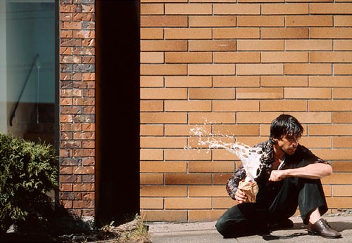
Picture 6: The Dress - Original, layers, edit


Again, very little was done to this picture. In this case, apart from raising the brightness and contrast, all I did was raise the saturation, however I used a little bit of masking over the white patch on the right side of the log so as not to have it lose too much detail in the highlights.

I also, as you can see from the close crops from the original negative above, used the healing and patch tools to remove some of the dandelions from the picture where they were in places that I felt detracted from the composition of the picture.
Picture 5: The Teeshirt - Original, layers, edit


This picture was one that felt ever so slightly overexposed due to the brightness of the sun reflecting off the white wall. I used an exposure adjustment layer to try and correct this. It also, once the contrast was increased, had a slight blue cast. I fixed this with a combination of lowering the saturation and lessening the blue with both Colour Balance and Channel Mixer.
Picture 4: The Jeans - Original, layers, edit


Picture 3: The Underwear

Once scanned, this picture required no adjustment beyond slight tinkering with the brightness and contrast to make it ready to print. During test prints I noticed that the printer profile reproduced the photographs slightly darker than I wanted. I therefore upped the brightness on all of them before the final print was made. The conversion to JPEG for uploading to this blog also seems to have lessened the highlight detail, in the other posts for my final images it is still possible to compare the unedited version to the final picture.
Picture 2: The Shirt - Original, layers, edit


I used one layer mask to lower the saturation of the wall before raising it for the picture as a whole, and two more to raise the contrast on the shirt to one level (+8) and the rest of the picture even further (+10). The layer titled 'Brightness/Contrast 2' was to raise the brightness on the picture ready for printing.
Picture 1: The Hat - Original, layers, edit


After removing any dust or hair that was caught when the negatives were scanned using a combination of the healing, clone and patch tools, I moved onto adjusting the colours the way I wanted. I brought up the contrast - in both the hat, and the metal fence - using two seperate adjustment layers each with their own mask. The saturation was raised on the image as a whole after I'd already lowered it on the top third of the picture, keeping the difference between the fence and the pavement at the ratio I wanted.
Three Pictures Chosen from Third Shoot


EDIT: I later decided not to use the picture of the shoe, as it's composition was not strong enough and was too similar to some of the other pictures in the series. The final number of images stands at 6.
Friday, 4 May 2012
Third Shoot Contact Sheet

My third and final shoot did not differ in any camera related variables, however I think I slightly overexposed for the first two locations in it. I had intended to meter for the midtones but forgot about the bright white wall and the bright highlights on the fence. All locations were discovered whilst walking around that day and picked on the fly. After an attempt at it, I did not deem the third location right for that particular item of clothing. The fourth one, on the log, worked out better. I could not, however, better my first composition there. The distance between the camera and the subject was intentionally closer than on the other pictures as I thought it would make a good last picture.
Thursday, 3 May 2012
Two Pictures chosen from Second Shoot


I decided against including any of the pictures of the tracksuit trousers as I did not get the positioning of them satisfactory in any of the photos I took. One also had a light leak which must have happened when the film presumably slackened at some point. The only other picture to suffer from this was the double of the shot with the underwear on the wall framed the way I decided upon for the final series. Fortunately for me, I had taken two of them at the time.
Monday, 23 April 2012
Second Contact Sheet

For shoot two I stuck with the same film, camera and lens. I chose a similar day to shoot on (the saturation of colour on this contact sheet is a lower than the actual negatives and has a grey cast) with bright sunshine when there were no clouds obstructing the sun. The aperture was all at either 11 or 16, just like the previous roll of film. I had only the third location, the large bushes at the edge of a field, in mind. The other places were discovered en route. I chose a place with sufficient mixture of plants and brick as I liked the idea from the original pictures I took with the underwear, but did not feel the locale or the outcome to be satisfactory enough to use in my selection.
Sunday, 22 April 2012


Wednesday, 18 April 2012
Research: Jeff Wall, Alejandro Chaskielberg and Logan Crable
In my search for photographers who have worked at creating images that are either staged, or compiled from several negatives to make a larger - fictional - scene, I found three whom I wanted to include here as research.


Jeff Wall is a Canadian artist best known for exhibiting his photography work as backlit phototransparencies. The pictures themselves are mostly multifaceted scenarios, often set up in homage to the work of famous painters and artists ('The Destroyed Room' and Delacroix, 'A Sudden Gust of Wind' and Hokusai). They require multiple photographs to be digitally and seamlessly montaged together and tend to take a year or two to complete. His pictures are all about the little details whether they are packed with areas for inspection or more minimal in their levels of interest.
The time he spends on each piece, and the use of phototransparencies, is inspiring but obviously something I do not have the option to take up. His art history influenced compositions and use of both digital post production and film photography are elements I can draw from in my own work.


Logan Crable is based in Brooklyn, New York having graduated with a BFA in Photography from Savannah College of Art and Design in Spring of 2010. I discovered his work by searching the internet for the phrase 'fictional scenarios' combined with 'photography' and my results turned up a statement from Crable on this page.
“In this body of work I have created fictional scenarios using allegorical characters to represent different abstract moments. I push the realistic element in my photographs to make them believable but surreal. I want to blur the line between reality and fiction. This is a strange world that goes much further than what one first perceives. Understanding that these pictures have a strong sense of narrative is also important to me. I want them to appear as unfinished stories, enacting themselves long after the viewer is gone.”

Jeff Wall is a Canadian artist best known for exhibiting his photography work as backlit phototransparencies. The pictures themselves are mostly multifaceted scenarios, often set up in homage to the work of famous painters and artists ('The Destroyed Room' and Delacroix, 'A Sudden Gust of Wind' and Hokusai). They require multiple photographs to be digitally and seamlessly montaged together and tend to take a year or two to complete. His pictures are all about the little details whether they are packed with areas for inspection or more minimal in their levels of interest.
The time he spends on each piece, and the use of phototransparencies, is inspiring but obviously something I do not have the option to take up. His art history influenced compositions and use of both digital post production and film photography are elements I can draw from in my own work.

Alejandro Chaskielberg is an Argentinian photographer who last year published the book La Creciente of photographs made on the Paraná River Delta. The portraits are all shot under moonlight and aided by flashlights, fire and strobes. In a deliberate attempt to avoid the standard documentary style they are all posed portraits reenacting typical moments and aspects of their day to day life. This brings a definite and distinctive style to the pictures, the shadows and deeper colours especially being darker than they would have under daylight or just flash.


Logan Crable is based in Brooklyn, New York having graduated with a BFA in Photography from Savannah College of Art and Design in Spring of 2010. I discovered his work by searching the internet for the phrase 'fictional scenarios' combined with 'photography' and my results turned up a statement from Crable on this page.
“In this body of work I have created fictional scenarios using allegorical characters to represent different abstract moments. I push the realistic element in my photographs to make them believable but surreal. I want to blur the line between reality and fiction. This is a strange world that goes much further than what one first perceives. Understanding that these pictures have a strong sense of narrative is also important to me. I want them to appear as unfinished stories, enacting themselves long after the viewer is gone.”
This quote has elements of what I propose for my series. The 'fictional scenarios', and also the blurring of reality and creating pictures with a 'strong sense of narrative' are similar to my aims. Although his pictures are portraiture rather than the more still life I will be working on, the point behind them appears to be related.
Monday, 16 April 2012
Research: Sophie Calle

Sophie Calle is a French writer and artist, working in the fields of installation and conceptual art, she also regularly uses photography in her pieces. When I explained my initial idea it was suggested I look at her work for inspiration.
Her 1979 book Suite Vénitienne depicts a project consisting of (as descibed in Stuart Jeffries' 2009 article in The Guardian) Calle on a trip "to Venice to follow a man she had met at a party, [where she] phoned hundreds of hotels until she found out where he was staying, and then persuaded a woman who lived opposite to let her photograph his comings and goings from her window."

The INIVA website's DARE resource site describes her subsequent piece, 'The Hotel'.
"A year later she returned to Venice where she got a temporary job as a chambermaid. She made a piece of work about her imagined ideas of who the hotel guests were, based on their personal belongings."
It also includes a quote attributed to Calle where she further explains...
"For each room there was a photograph of the bed undone, of other objects in the room, and a description day by day of what I found there."
Picture 1 was found here.
Picture 2 was found here.
Although Calle's work is intriguing, and definitely something I can draw influence from, these particular projects of hers are too based in documentary of reality compared to what I want to do. I will have to look at someone whose work is based around constructing images that, whilst of potentially possible situations, does not rely entirely upon ideas of truth and being a record of actual happenings.
Two Pictures chosen from First Shoot


These are two pictures, unedited, selected from those in my first shoot. I think of them as being the two most successful images from the film and those most likely to feature as final images. The unusual colours came from the scanner and were not my intention.
The first one I picked over the other, similar, shots because I preferred the composition of it to the first picture I took, which had the hat to the right of the frame, and because it was sharper than the one after it. I chose to use one of the pictures of the hat there, as opposed to one of it leaning against the wall because I wanted to use the picture of the shirt that I had taken in the same location and them all to be in different places so as to differentiate their situations.
Thursday, 5 April 2012
First Shoot Contact Sheet

This is the contact sheet from my first shoot.
The colours have been adjusted digitally to resemble their original hues.
I shot on Kodak Portra 400 ISO colour film with a Bronica ETRC and a 75mm Zenzanon lens. The camera was mounted on a tripod for all exposures and a light meter was used to measure the shutter speeds necessary, with the aperture at 11 in the first seven pictures and at 16 for the last four. The items of clothing picked for the images were sourced in a fancy dress shop in Hammersmith (the hat and the underwear) and from my own wardrobe (the shirt). The locations were all chosen on the day, although the first two were known to me prior.
Wednesday, 21 March 2012
Idea for Portfolio/'Something Is Missing'


The title and theme of the exhibition that I am working toward is 'Something Is Missing'. I have picked my project to fit with that theme. The clothes are obviously intended to be missed by the wearer, but in the pictures it is they - as well as the story behind why the items were abandoned or lost - that is absent.
I want my series, despite its being inspired by real occurences - ones that I think most people will have memories of similar sights - to be obviously constructed. This is because the way I want to work on this series is by working to make technically satisfactory and visually pleasing pictures that evoke a fictional story that I have concocted.
I will use elements of the pictures themselves, their construction and subjects, to stress that the series is not a documentation of actual situations. These will also add a distinctive visual style to the mix.
I will do this:
By having a shallow depth of field, emphasising the artificial nature of the way of seeing. In opposition to Peter Henry Emerson's idea that having one area of sharp focus is closer to how the human eye sees, I observe that whilst one can only focus on one plane at a time the bokeh of a photograph remains the same rather than adjusting along with the the movement of the eye upon it. Therefore, in my opinion, the shallow depth of field frozen by photography highlight the artifice of the medium as a way of seeing.
By shooting in colour. This is an example of avoiding anything that would suggest to a casual viewer that the pictures are not set up. Black and white having become visual shorthand for photographic realism in the same way that sepia toning represents the past, because of their use in that genre and at a certain time period.
By using items of clothing that are all either black or black and white. This is part of the 'distinctive visual style' I mentioned. It adds uniformity, pun intended, to the pictures and is part of my deliberate use of colour in creating the pictures. Though I want the surrounding location in the shots being fairly realisting in their colouring.
By (subtly) digitally manipulating the pictures to ensure they look how I want them. My scanning the negatives and digital printing, though mostly due to the necessity of it being cheaper for me and having readier access to it over a colour darkroom, also helps me by making it easier for me to remove any blemishes or accidental damage to the pictures as well as any adjustment of the colours.
Tuesday, 28 February 2012
Large Format Workshop
My first forays into learning large format was with 5x4 400 ISO film on a Field Camera that had been borrowed from the Photography Department.
We initially got to grips with the camera in the Large Format Workshop on the afternoon of the 23rd of February, however the dark slides we used were not the ones that had been loaded with film. So we returned on the 27th of February for another go.
This is a scan of the negative I produced on that day, it was exposed with the help of an external light meter.

As you can see, the focus was misjudged and is a little soft on the tombstone, which should have been the main focal point. It was quite a grey and overcast day, but the wide aperture was mostly an aesthetic choice.
I very much enjoyed the process of using such a large camera that produces so detailed a negative, however I am not sure I am particularly suited to working so slowly. I will probably try and get some more practice so I have at least achieved a negative that is in focus.
Sunday, 26 February 2012
Medium Format Workshop

The Photographic Artefact
This blog will be my reflective workbook for 'The Photographic Artefact' module and a journal of sorts displaying my progress over its course and the outcomes from any of the workshops I attend.
Subscribe to:
Comments (Atom)