This module's portfolio was developed with its being exhibited as a final outcome in mind.
Ideally the prints would be A2 and window mounted using archival quality mounting board held together using acid-free linen tape. These would be in undecorated black wooden frames and hung either left to right along one wall or clockwise over several in the same order as is in my printed portfolio.
Mounting Board: http://www.preservationequipment.com/Store/Products/Conservation-Materials/Mounting-$4-Framing/Framers-Mounting-Board
Linen Tape: Linen Hinging Tape (gummed) 1"x50 yds. (150ft) http://www.silverprint.co.uk/ProductByGroup.asp?PrGrp=822
Frame: http://www.imageframes.co.uk/product/IF4W420H594/a2-22mm-black-paint-picture-frame
Carl Farrugia
The Photographic Artefact
21094676 The Photographic Artefact Carl Farrugia UWL
Sunday, 13 May 2012
Friday, 11 May 2012
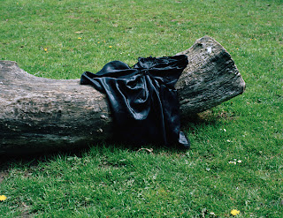
Picture 6: The Dress - Original, layers, edit
Again, very little was done to this picture. In this case, apart from raising the brightness and contrast, all I did was raise the saturation, however I used a little bit of masking over the white patch on the right side of the log so as not to have it lose too much detail in the highlights.
I also, as you can see from the close crops from the original negative above, used the healing and patch tools to remove some of the dandelions from the picture where they were in places that I felt detracted from the composition of the picture.
Picture 5: The Teeshirt - Original, layers, edit
This picture was one that felt ever so slightly overexposed due to the brightness of the sun reflecting off the white wall. I used an exposure adjustment layer to try and correct this. It also, once the contrast was increased, had a slight blue cast. I fixed this with a combination of lowering the saturation and lessening the blue with both Colour Balance and Channel Mixer.
Picture 4: The Jeans - Original, layers, edit
Beyond increasing the saturation and contrast, I only made one major alteration to this picture. I felt there was too much detail in the space under the bush, revealing too much rubbish and mess that was wedged under there. In my attempt to remove this clutter, I started by making some subtle removals using the clone and healing tools. I then made an adjustment layer with a mask in which I lowered the brightness just in the places I considered necessary, painting on the mask so it would only affect where I needed it to.
Picture 3: The Underwear
Once scanned, this picture required no adjustment beyond slight tinkering with the brightness and contrast to make it ready to print. During test prints I noticed that the printer profile reproduced the photographs slightly darker than I wanted. I therefore upped the brightness on all of them before the final print was made. The conversion to JPEG for uploading to this blog also seems to have lessened the highlight detail, in the other posts for my final images it is still possible to compare the unedited version to the final picture.
Picture 2: The Shirt - Original, layers, edit
I used one layer mask to lower the saturation of the wall before raising it for the picture as a whole, and two more to raise the contrast on the shirt to one level (+8) and the rest of the picture even further (+10). The layer titled 'Brightness/Contrast 2' was to raise the brightness on the picture ready for printing.
Picture 1: The Hat - Original, layers, edit
After removing any dust or hair that was caught when the negatives were scanned using a combination of the healing, clone and patch tools, I moved onto adjusting the colours the way I wanted. I brought up the contrast - in both the hat, and the metal fence - using two seperate adjustment layers each with their own mask. The saturation was raised on the image as a whole after I'd already lowered it on the top third of the picture, keeping the difference between the fence and the pavement at the ratio I wanted.
Subscribe to:
Posts (Atom)


